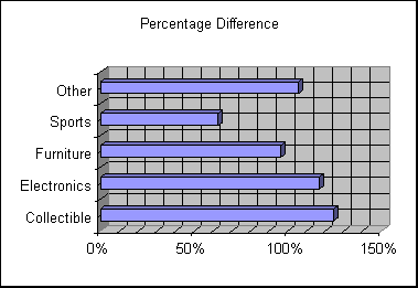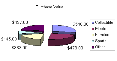

This chart is almost completely useless without the addition of the original purchase price chart.

Now you get at least a very basic idea of what the value of each category is today. If the percent difference chart had actual currency values on it, the chart would be even more useful. It really doesn’t matter when the items were purchased because you didn’t purchase them all at the same time. All the items are distributed into five categories and the charts depict the overall value of those categories. If you wanted to know the change of value for each item you would have to calculate each item as a separate group, and that would make the charts quite a mess.